Introduction
Simplicity isn’t about removing elements—it’s about focusing on what matters most. In web design, clarity drives conversions. The easier it is for visitors to understand your message and find what they need, the more likely they are to take action.
1) Visitors decide in seconds
Studies show users form an impression of a website in under 0.05 seconds. If your layout feels cluttered or confusing, they’ll leave before they read a single word. Clean structure, balanced whitespace, and strong visual hierarchy build instant trust—no flashy animations required.
2) Fewer distractions mean higher conversions
Every button, banner, and block of text competes for attention. Simplifying design reduces cognitive load and makes your main call-to-action stand out. Ask yourself: if someone lands on your homepage, can they immediately tell what to do next?
3) Mobile users need focus
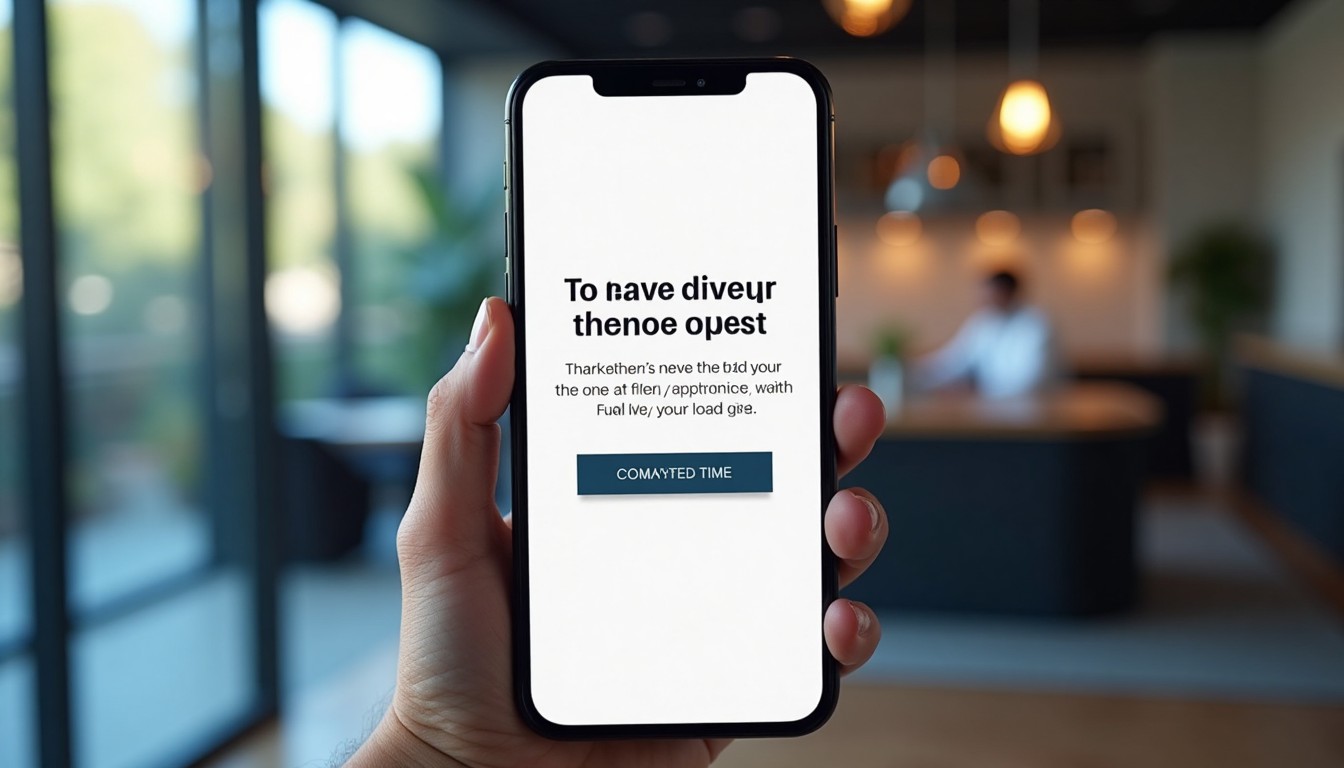
Over 60% of visitors browse from their phones. Minimalist layouts scale gracefully across devices. Large text, tappable buttons, and visual breathing room create a seamless experience without the need to zoom or scroll endlessly.

4) Simplicity builds trust
Overdesigned sites can look like scams. Simplicity communicates confidence. When your brand looks calm, organized, and straightforward, users subconsciously associate that with reliability and professionalism.
5) Visual hierarchy guides the journey
Use typography, contrast, and spacing to show what’s important. A bold headline, a supportive subheading, and a clear action button create a natural reading flow that gently leads users toward conversion.
6) Content clarity > clever design
People don’t visit your site to admire your layout—they come to solve a problem. Write headlines in plain language and use simple navigation. When visitors find answers quickly, trust and conversion follow.
Quick Simplification Checklist
- Limit colors to 2–3 core brand tones
- Use consistent spacing and alignment
- Prioritize mobile layout early
- Make one CTA the hero of each page
- Keep headlines short and clear
