Introduction
The SolarSoft Media website isn’t just our online presence — it’s a technical statement. Built from the ground up in PHP with modular partials and semantic HTML, it’s designed to demonstrate the same principles we apply to client projects: clarity, accessibility, and performance.
1) Setting the objectives
The goal was to establish a clean, trustworthy brand presence with consistent typography, color, and structure. From the start, we planned for scalability — the site had to support future growth in services, portfolios, and case studies without requiring a rebuild.
- ✅ Use modular PHP includes for rapid updates
- ✅ Prioritize accessibility (semantic headings, alt text, keyboard focus)
- ✅ Optimize for SEO clarity and shareable metadata
- ✅ Keep page weight low for faster load times
2) Building the structure
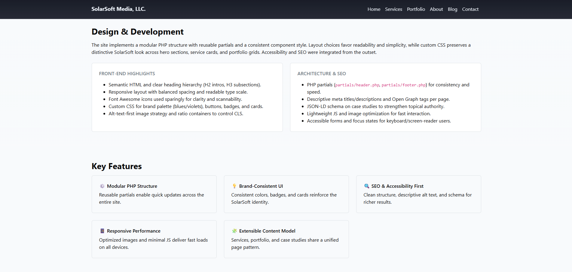
The foundation uses a lightweight PHP architecture with shared header and footer partials. Each page inherits consistent navigation, typography, and meta tags. Custom CSS and Bootstrap 5 provide responsiveness without bloat, while Font Awesome adds scalable icons that match our brand palette.

3) Balancing accessibility and SEO
Accessibility and SEO were integrated from the outset. Semantic tags help screen readers and search engines alike. We used descriptive alt text, logical heading structure, and JSON-LD schema to enhance visibility and clarity across Google and social platforms.
4) Front-end performance tuning
Images are pre-optimized for ratio and compression to avoid layout shift (CLS). Minimal JavaScript keeps interactions snappy while ensuring compatibility across devices. Pages consistently pass Google’s Core Web Vitals tests, with excellent metrics for First Contentful Paint and Speed Index.
5) Key features that drive maintainability
- Modular PHP Structure: shared header/footer partials for faster edits
- Responsive Performance: optimized for mobile-first design
- Brand-Consistent UI: unified buttons, badges, and color system
- SEO & Accessibility First: structured data and focus outlines
- Extensible Model: Services, Portfolio, and Blog all share reusable page templates
6) Results and lessons learned
The final site loads quickly, scales easily, and presents SolarSoft Media’s identity with clarity. Creating a system around modular design principles saved hours of maintenance time and set a solid foundation for expansion — including this blog.

7) What’s next
- 📈 Expand the blog with SEO and UX insights
- 💡 Add analytics-driven conversion tracking
- 🧱 Publish more behind-the-build stories to inspire future clients
The SolarSoft Media website is proof that simple, maintainable architecture can scale beautifully. Every design decision reinforces our guiding principle — clarity over complexity.
